pack4png: A Preprocessor for PNG or GIF Compression
DRAFT OF July 06, 2003 (including minor corrections at later dates)Theo Pavlidis
t.pavlidis AT ieee.org
Abstract
Compression schemes based on Lempel-Ziv type of algorithms (such as PNG and GIF) suffer when images are blurred or scale because of the introduction of new intensities near transitions between the original intensities. Thus a pixel string of the from AAAABBBBB may be transformed into the form AAAAxBBBB where x takes a value between A and B that varies widely over the image. Compression can be impreoved significantly if the value of x is fixed throughout the image without any visible distortions. This paper describes a method of performing such a transformation as well as smoothing of low amplitude fluctuations. The method is based on histogram analysis relying on the observation that histograms of few color images that have been blurred have a form consisting of sharp peaks (around the original colors) and flat areas corresponding to intensities introduced by blurring. In addition, criteria are introduced for deciding whether an image is a good candidate for such a transformation or should be encoded either in JPEG or directly in PNG or GIF. Discussion of implementation and examples are included.
1. Introduction
Today still image compression technology is dominated by two types of technology: frequency domain schemes such as JPEG and space domain schemes such as PNG (Portable Network Graphics) and GIF (Graphics Interchange Format) [1, 2 ]. Frequency domain schemes implement lossy compression by not transmitting high frequency components of the image. PNG and GIF do not implement lossy compression as yet (although there are current research efforts with that objective [3]). A major problem with lossy compression is that numerical measures of image similarity do not always agree with subjective human similarity. A simple case of such a discrepancy is ilustrated in FIgure 1.
 |
 |
 |
 |
 |
A | B |
C | D | E |
Figure 1: The root mean square error (rms) between images A and B is 3 while the rms between the images A and C is 4. The rms between A and D is 14 and the rms between A and E is 39.7. |
||||
Tthe root mean square (rms) error picksimage B as a better approximation to image A than image C while human perception picks image C as the better approximation of the two. One might argue that image D (or even E) is a better approximation to A than B is. While the difference between D (or E) and A is clearly visible it may be acceptable if the purpose of the image is to display a message and the only consideration is that of contract. Similar results obtained with "real" images are included in Section 6. (The unsuitability of rms and other numerical measures has been discussed in the literature, at least, as early as in the 1970s in papers written by the late David Sakrison and others. However, these results seem to be ignored in current discussions, hence the need for this reminder.)
Because of the difficulty of dealing with issues of human perception I believe that lossy image compression is best handled by pre-processing filters rather than by the encoding algorithm. While such filters must take into account the properties of the compression scheme their main goal would be to apply transformations that will preserve the impression that the original image makes to human viewers. Such fliters are not appropriate for applications such as forensic or medica where images are going to be subject to various enhancement techniques. But they are appropriate for all applications where the image is going to be viewed unaltered.
This is a vast topic that has received relatively little attention in the literature and the work reported in this note deals only with a particular class of images, namely those that have few color intensities, each occupying large areas in the image. This is the case with cartoons, business charts, etc. When such images are scanned or scaled new color intensities are added near boundaries between the original colors because of an averaging operation either by the point-spread function of the scanner or the mapping of several pixels into one during scaling. In addition scanned images are affected by noise. Another cause for the introduction of additional color intensities is the coding of few color images with JPEG. JPEG eliminates the high frequencies caused by sharp boundaries and the reconstruction may not only be blurred but also it may include fluctuations because of Gibbs effects. For brevity we shall refer to all such distortions as scanner effects even though some of them may be due to other causes.
Such variations in intensity may be invisible or barely visible to the human eye but they increase significantly the size of the compressed file by space domain schemes (PNG or GIF) because the underlying Lempel-Ziv type algorithm cannot find many repeated pixel patterns. We can state our problem as the removal of scanner effects in order to increase the efficiency of compression by space domain schemes.
We will use the term packing to denote the effect of such filters and the term packed image to denote the output of these filters. It is arguable whether PNG or GIF of packed images encodings should be called lossy. Earlier versions of the paper included the word "Lossy" in the title but it is omitted now because the filter (when properly applied) performs in effect image enhancement. The purpose of packing is to reduce the number of color intensities introduced during scanning, scaling, or JPEG encoding and, if possible, eliminate such intensities altogether. Therefore packing is in essence a de-blurring process. Because de-blurring is an inherently unstable process, it requires sophisticated algorithms that have significant computational requirements (see [4, 5], for example). It is beyond our scope to explain why this is so but we point out that simple filters are not applicable. A linear low pass filter will reduce fluctuations in the flat areas but will also introduce additional blurring. A linear high pass filter will reduce the blurring but also increase the fluctuations.
Packing attempts to achieve the effect of de-blurring by histogram analysis and as such is related to advanced color quantization techniques that have been applied recently in image database searches [6-8]. However, these techniques use large sets of colors and all images in a database are quantized according to these colors. Packing quantizes into few individual colors that are specific to each image. Packing has also similarities to histogram based segmentation methods ([9, 10] for example) but it differs both in the method used to partition the domain of the histogram and because it does not merge pixels at rarely encountered intensities into larger regions except when compression is maximized. In addition, because its analysis is limited to the histogram, it has very small computational requirements. It should be noted that GIF implementations that use a global color table perform a kind of packing. We discuss this issue in Section 5.
The basis of the method is to look at each one of the basic (RGB) colors separately and for each color form zones of intensities. Then all pixels with intensity in a single zone are assigned a single representative intensity.
2. The Basic Idea
The histogram of an ideal image with only a few colors consists of single isolated spikes at the color intensities used. However when the image is blurred (for any of the reasons stated above) there is a change in its form for the blurred image. Let C1 and C2 be the constant intensities of two adjacent regions R1 and R2 in the original image. Then near the boundary between the two regions new intensities will appear given by the expression
C(f) = fC1 + (1-f)C2 0 < f <1
where f is the integral of the averaging function over the region with intensity C1. (We assume a normalized averaging function with integral 1.) We shall refer to such intensities as mixture intensities and to C1 and C2 as intended intensities.
At a pixel on the boundary between the regions f equals 1/2 and the number of pixels with intensity C(1/2) equals the total length of such boundaries. In general, let L(f) denote the number of pixels where the integral of the averaging function over the region with intensity C1 has value f. Then the histogram of the blurred image will contain additional entries with value L(f) at point C(f). If L is the length of the contours between the two regions, then L(1/2) will be equal to L. If the boundary is convex towards R1 and, therefore, concave towards R2, then the (digital) contours displaced from the boundary inside R1 will be shorter than L and the opposite will be true for the contours inside R2. If two numbers q and p are such that 0 <q < 1/2 < p < 1, then L(q) > L > L(p). If A1 and A2 are the respective areas of the two regions we will also have L(0) equal to A2 and L(1) equal to A1. For regions of complex shape the boundary will contain both convex and concave parts towards a region, so we that L(f) will be approximately equal to the length L of contours between the two regions.
Therefore the histogram of the blurred image will consist approximately
of single spikes at Ci with value Ai -
Ld/2, where d is the diameter of the support of the point-spread
function. Between these two spikes there will be a set of (approximately)
constant values L at each point. The sum of all such values will
be Ld so the that the area of the histogram will maintain its original
value A1 + A2. Because of noise in real histograms
the single spikes are replaced by peaks that have approximately the same
shape as the noise distribution (usually Gaussian), so a real histogram
of a two intensity image has the form shown in Figure 2. (Obtained from
a real image.) We shall use the term noise intensities
as the variations of the intended intensities because of noise.
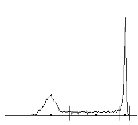
| Figure 2: Histogram of a two-color image shown in square root scale (plotting √(h(i))√(max(h(i)) rather than h(i)). The peak at the higher intensity deviates from a symmetric shape because of saturation. The short vertical line segments represent the results of the application of the proposed algorithm for the partition of intensities. The dark squares mark the intensities assigned to all pixels whose original intensity was in each interval. |
In images with more than two intensities the histogram will consist of the superposition of shapes such as that shown in Figure 2. As long as intensities are few, far apart from each other, and occupy areas that large compared to the support of the point-spread function, the histogram will consist of a sequence of Gaussian-like peaks separated by flat regions.
We should keep in mind that while images with large areas of solid color with some noise and blurring produce histograms such as shown in Figure 2 we cannot conclude from the form of the histogram that the image has this properties. There is loss of information in going from an image to a histogram and therefore the judgement whether a picture is appropriate for the process we describe must be made in advance. This can be done either subjectively (by observing that an image has large areas of solid color) or automatically as described in the next Section.
The main task of a histogram-based de-blurring algorithm is to identify such regions as has been done in Figure 2 and shown with short vertical lines. We shall use the terms dense and sparse to describe these two types of histogram intervals. (Note that because of the square root scale used in Figure 2, the difference in the histogram amplitudes in the two types of regions is attenuated.) Dense intervals contain intended intensities and their variations because of noise while sparse intervals contain mixture intensities as well as variations of both mixture and intended intensities.
At this point we have two options: (1) Replace all values in an interval by a single value and remap pixel values accordingly; (2) split sparse intervals into two parts and merge each half with the adjacent dense interval. The results of the second method corresponds to traditional thresholding for two intensity images or multithresholding for images with more than two intended intensities (for example [9]). The first method maintains additional intensities to achieve better visual impression similar to that obtained with "anti-aliasing" in Computer Graphics.
3. When to Use JPEG, when to Use PNG or GIF and when to Use Packing
Because the shape of the histogram is not by itself a reliable guide, we must look for some other way to decide whether a picture should be packed or even if PNG or GIF are appropriate at all. (Current guidelines in various web sites are far too simplicistic because they rely only on the number of distinct colors present in an image without regard to their distribution.)
If human time is not an issue, one could apply each of the encoding schemes on an image as well as packing and observe which method produces the smallest file with no visible changes in the image. It would be desirable to automate this procedure but there are several problems. Some are practical. Most people create image files within applications that offer a menu of image formats for saving the image files and automation is not an option there. While such applications could be modified to offer an automatic selection there is another obstacle. There are no reliable numerical criteria for judging the quality of an image. (We will say more on this issue when we discuss some of the experimental results in Section 7.)
A simple criterion is to look at a (three-dimensional) color histogram and count the number of occupied cells. Images with a few colors will be appropriate for a space domain scheme, while those with several colors should be encoded by JPEG. However such a count will not distinguish sligh variations of colors from major ones and may suggest JPEG for few color images that have been distorted by scanner effects. (For such images the JPEG file is actually smaller than the PNG or GIF file.) We can ignore slight variations by constructing the color histogram not for individual intensities but for bins of intensities and counting the number of occupied bins. While a group of color variations may be split into more than one bin the increase in the count is not likely to be significant. If B is the bin size and the image assigns a byte to each basic color the total number of such bins will be (256/B)3. Chosing B equal to 16 yields 4096 cells. Initial tests have suggested that the fraction of pixels with color in the top few most common bins is a reliable predictor. We use the symbol D and the term distribution to denote the percent of pixels in the top three cells for color images and in the top two cells for gray images. For images where JPEG turned to be the clear choise (after trying all formats) D was always below 20 while for images where a space domain scheme (possibly after packing) was the clear choice D was always above 70. Using the eight images of Section 6 we found a regression line
R = 0.0472*D - 0.4227
where R is the ratio of the JPEG size over the packed PNG. This yields R equal to 1 (i.e. the JPEG size is tha same as the packed PNG size) for D equal to about 30 and R equal to 2 for D equal to about 50. See Section 6 for more details. The normalized regression slope is 1.196 which is close to 1 which would be the case if the relation between R and D was strictly linear and deterministic. Note that there is a significant subjective element in this equation: the files whose size are compared are those where the JPEG and packed PNG images appear equally good to a single human viewer (the author).
While a high value of D implies that a space domain scheme is appropriate we must look at the histogram itself to decide whether packing is necessary. Gray scale images with more than 40 colors and color images with more than 4000 colors (in the three-dimensional histogram) seemed to benefit most by packing.
There is a class of images where the above rules do not apply, namely images that do not have large areas of solid color (and therefore produce low values of D) but where PNG or GIF yield smaller files than JPEG. This happens when an image consists of replications of small subimage which has a wide variety of colors. Because no single color is dominant the value of D will be small and the subimage itself would be best encoded by JPEG. However a Lempel-Ziv type of algorithm detects the repetition resulting in a small PNG or GIF file. No such images were found in the author's collection but it is easy to construct them artificially. A simple way is to take a scan line from an image with low D and constructed a new image by replicating that scanline (Click here for such an example that has D 17 and R 6.8).
4. Implementation of Packing
It is quite easy for a human observer to divide a histogram into dense zones around peaks and sparse zones around flat areas. The challenge is to perform this operation automatically. One approach is to use curve segmentation, for example approximation by quadratic splines with variable knots. Because this is a nonlinear approximation problem one might try an simplified version and while this works well for relatively clean data such as shown in Figure 21, it fails in other cases. For example, histograms of images with more than two colors may be too "crowded," or in other cases several values may be absent from the curves (for example, the scanner may have a "stuck" bit), so that the histogram curve is very noisy.
Another approach is to select a level on the histogram values and divide its domain into zones, depending on whether the values are above (for dense zones) or below (for sparse zones) the level. (We use the term "level" rather than "threshold" to avoid confusion with traditional use of the latter term for dividing the domain of the histogram. "Levels" are thresholds on the range of the histogram). However it is impossible to select a level that is valid for a wide range of images. The solution is to use a set of levels as shown in Figure 3 and combine the results in a similar way that edges are found in the scale-space approach (see, for example, [11-13]). In the typical application of scale-space several filtered versions of the image are constructed and in each one of them feature points are found. Feature points from each version (scale) are aggregated to form feature points for the original image. In our case we have only one image (the histogram plot) but we vary the method of feature detection (the crossings between levels and the histogram plot) so that are also left with a set of features. The following is a detailed description of the method of aggregation.
For each level we make a list of the intervals where the histogram is above the level while rejecting fluctuations that are likely to be noise. We define them as two successive crossings in the same direction that are closer than some minimum intervals min_interval and also the maximum difference in histogram values between these crossings is below some min_change. (The third and fourth level in Figure 3 contain several such fluctuations.) Then we construct a tree whose nodes are the (dense) intervals found above and branches connect two nodes that are on successive levels and the interval on the higher level is contained within the one in the lower level. A depth-first traversal of the tree produces a pair of paths around each leaf of the tree that correspond to peaks of the histogram. The length of the paths corresponds to the height of the peaks.
This approach provides us with means to control how aggressive the transformation is going to be. Let N be the number of levels used (in Figure 3N equals 9). Then we may decide to keep peaks where the paths around them have length at least m (1≤m≤N). If m equals 1 we keep many peaks, therefore achieving better quality and lower compression. If m equals N we keep few peaks achieving high compression at the expense of quality. The peaks that are kept are mapped into dense zones that are interleaved with sparse zones.
It was found that in some images the zone partition was too fine so a set of heuristic was added: (1) eliminate zones that span very few intensities; (2) eliminate dense zones if their intensities occur in fewer than 1% of the pixels. The conditions for these heuristics do not occur in most images so their application is relatively infrequent. It was found useful to condition the application of the heuristics on whether the image has color or is gray scale and the value of D. Because in this implementation each basic color is examined separately, modification of intervals is performed less aggressively for images with color than in gray scale. Modification is performed more aggressively for images with high values of D.
In addition, we may decide to parcel out all sparse zones into the adjacent dense zones to achieve even higher compression, but at the expense of possible aliasing effects.
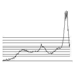 |
Figure 3: A histogram with 9 levels overlayed (the bottom horizontal line is the axis). Crossings are always determined in pairs, thus the lowest two levels generate each two crossings, one where they cross the histogram curve and another at the end of the range. Enlarged and annotated version. The plot is in square root scale. |
The program implementing this method is quite simple, except for the part that determines how the end points of intervals obtained at various levels are mapped into a single value. For images where color intensities are few, far apart from each other, and occupy areas that are large compared to the support of the point-spread function (such as the one whose histogram is shown in Figure 2), the zone dividing points obtained with each level are close to each other so this is not a serious problem. For other images (such that corresponding to the histogram of Figure 3) the crossings are quite spread. We have chosen to make dense intervals (corresponding to peaks) as wide as possible at the expense of sparse intervals (see the enlarged version of Figure 3). The rational behind this choice is the following.
Key Observation: Intensities in the dense zones are variations (usually because of scanner noise) of the intended intensities. Those in the sparse zones are mixtures of the intended intensities. If we err by classifying an intensity as a variation rather than a mixture we will only introduce some minor aliasing. If we err in the opposite intention we will introduce noise in the middle of flat areas degrading both appearance and subsequent compression.
Special care may be required for the two end zones. If one or both are found to be sparse they should be merged into the adjacent dense intervals because they cannot be mixture intensities and can be due only to noise.
The last concern is the selection of value for each zone to represent the rest of the values. For dense zones we select the zone value occurring in most pixels. For sparse zones we select the midpoint of the zone. This is illustrated in Figure 2.
5. Packing for GIF that uses a Global Color Table
Under certain circumstances GIF's restriction to 256 colors forces some packing, expecially when a global color table is used. A commonly used such table has six intensities per primary color (6x6x6) and we shall refer to such encodings as 6x6x6 GIF and use the term adaptive GIF for encodings using a local color table. Packing for adaptive GIF is no different than packing for PNG but packing for 6x6x6 GIF requires special attention because we must deal with GIF's implicit packing. The latter is far from optimal for removing extraneous intensities and it often degrades the appearance of the image by introducing dithering to approximate colors. Still it produces smaller files than adaptive GIF or PNG and a careless comparison of 6x6x6 GIF and PNG (or adaptive GIF) may lead one to the erroneous conclusion that 6x6x6 GIF is more efficient. (Comparisons of this type can be found on certain web sites, for example [14]). For this reason we illustrate the performance of the various versions of GIF and PNG on an artificial image of a red 256x256 square. The following table that shows the size in bytes of the encodings. In the first two cases the intenisty is kept constant, in the third pseudo-random white noise that is approximatelly Gaussian with mean 0 and sigma 1 (root mean square 0.5) has been added.
Intensity |
6x6x6 GIF |
adaptive GIF |
PNG |
200 |
4,885 |
392 |
789 |
204 ( a table value for 6x6x6 GIF) |
1,227 |
392 |
789 |
200 plus slight noise |
4,890 |
16,374 |
30,399 |
JPEG requires 1653 bytes for all three images because it filters out the noise. The 6x6x6 GIF and JPEG implementations used in these tests are from Microsoft's Paint program distributed with Windows XP. The adaptive GIF implementation used is from Adobe Photoshop 7.0. PNG results are from the author's implementation. Files produced by other PNG implementations are some times slighter bigger and other times slightly smaller. ( While the adaptive GIF file in this example is smaller than the PNG file this is not true in general. The same implementations often produce a GIF file that is larger than the PNG file.)
Because the human eye cannot detect more than 1% varations in intensity even when they are displayed side-by-side the third image appears uniformly red and all three images appear indistinguishable with the possible exception of the 6x6x6 GIF encoding of the first and third images where some viewers may be able to see the dither. The introduction of invisible distortions leads to a 40 fold increase in the size of both adaptive GIF and PNG files. In contrast, noise increases the size of the 6x6x6 GIF file by only 5 bytes. When the noisy image is packed the adaptive GIF and PNG files are 392 and 789 bytes respectively, the same as in the noise free image.
It is easy to modify the last step of the packing algorithm to make the packing well suited for 6x6x6 GIF. We need only to change the rule for selecting a representative value for each zone by picking values that are present in the 6x6x6 GIF color table. If no values fall within the zone, we may select a linear combination of color table values that will produce a small dither matrix. For obvious reasons, the gains provided by packing in 6x6x6 GIF compression by processing are nowhere as large as the gains achieved in PNG or adaptive GIF compression. When such a filter is applied to the third image the resulting 6x6x6 GIF file is 1227 bytes. This "mutant" version of pack4png is called pack4gct (pack for global color table).
6. Experimental Results
For images that fit the basic model well the crossings depend very little on the level, so the effect of parameter variation is negligible. (See another variation of Figure 3.) For other images the effect can be significant. Figure 4 shows one example of the application of the method in a gray scale image with the words "WINTER SALE". Because the effects of pack4png are not visible in reduced scale images we show a part of each of the full size images consisting of the sequence "SA".

| 
| 
|  |
| Original (33,933) | Minimum Compr. (2,619) | Maximum Compr. (2,203) | Quantized (2,332) |
| Figure 4: Part of four versions of an image and the respective sizes in bytes of PNG encodings of the full image | |||
The leftmost image is the original and the next two are the results of applications of pack4png without splitting zone (minimum compression) and with splitting zones (maximum compression). The choice of a level has no effect on this image (its histogram is that of the variation of Figure 3 ). Most of the differences are concentrated in the pixels between the light and the dark regions because this is where the additional intensities had been introduced by scanning and subsequently modified by pack4png. (See Close up with numerical pixel values.) The rightmost image is the result of quantization by keeping the two most significant bits. While the size of the image is bytes is compared to that obtained by pack4png there is a significant distortion in the gray levels. (Such a distortion is far more visible in color images.) Keeping only the most significant bit results in blank image because the two intensities do not differ in the most significant bit. Histogram equalization produces noisy images of poor visual quality as well as large PNG file size, as expected [15].
Because of the large size of image files we list additional examples only through hyperlinks to the pages containing them limiting the material in this section to general observations. Each page contains nine images together within statistics about them. The images are: PNG encoding of the original, six PNG encodings following pack4png with anti-aliasing and three PNG encodings following pack4png without anti-aliasing. The caption under (or next to) each processed image lists the compression strategy, the space in bytes of the PNG file, the percent of its size with respect to the original PNG file, the number of zones per basic color, and the root mean square error between the original and the packed image. The latter is included in order to confirm its unsuitability for image comparison that was stated in the introduction.
Allbut one of the pages of the examples listed below were produced automatically using the "Web" button of the "p4pApp' application. The exception is the page with the GIF encodings. Because the code for PNG was publicly available it was relatively easy to integrate it into an application. In contrast GIF encodings were obtained manually by reading a PNG or BMP image into Adobe Photoshop and then saving it in GIF format.
6. 1. Color Images
"Winter Sale" This is an image that has been scanned from a sales catalogue and besides the normal blurring by the scanner there are traces from the back page. Because the original was supposed to have only two colors pack4png works very well here achieving 25:1 additional compression for a total of 57:1 with no visible loss in quality. (The compression is not as good as in pack4png version 1.0 where additional compression was 28:1 but the current implementation is more robust overall.) Comparisons with JPEG are shows in a table at the end of this document.
Part of IAPR logo This is a three color image (orange, gray, and white) that has been blurred by JPEG encoding. The original was JPEG so pack4png eliminates artifacts introduce by that method. Additional compression of 18:1 is achieved compared to 10:1 for version 1.0. (For compression with anti-aliasing pack4png version 1.0 kept the shadow cast by the letters in the original logo but it introduced color distortions in it.)
Dilbert gets less than a raise and Dilbert with M.T.Suit These images contain several colors including halftones but pack4png still helps by providing about 4:1 additional compression with no significant drop in quality.
Dartmoor Landscape This has been used by Ed Avis for his work on lossy PNG compression and it is has been obtained from http://www.beautiful-devon.co.uk/00-7disc/dartmoor01.jpg. The image has a large range of colors and it does not fit the pack4png model, therefore additional compression is only 1.5:1 before asignificant drop in quality occurs.
6.2. Gray Images
Serenading Mouse This is part of a scanned New Yorker cartoon. Highest additional compression is about 10:1. (Not as good as in version 1.0 where it was nearly 20:1.) There is also a page showing GIF encodings. There are no significant differences in the results between the two formats.
Gray version of "Winter Sale" Parts of this image were used in Figure 4.
Gray version of Dilbert with M.T.Suit Additional compression here is 4:1 for good quality approximations.
6.3. Comparison with JPEG and values of D
The following table lists the values of D for the above images, the number of colors in the original and in the packed version, and a comparison between JPEG and packed PNG sizes. All JPEG encodings have been obtained by the Dell Image Expert application using the "Medium" quality setting. The last column indicates the parameters of the packing chosen for comparison. The choice was made by selecting the version with the smallest size that appeared subjectively of acceptable quality.
Image |
D |
original colors |
packed colors |
packed PNG size |
JPEG size |
size ratio JPEG/PNG |
packed choice |
Winter Sale |
74% |
11,107 |
4 |
4,146 |
11,658 |
2.81 |
1,6 |
IAPR logo |
83% |
26,116 |
4 |
11,852 |
37,602 |
3.17 |
1,6 |
Dilbert/raise |
36% |
39,644 |
21 |
27,959 |
23,613 |
0.84 |
1,2 |
Dilbert/suit |
27% |
24,305 |
32 |
27,302 |
27,836 |
1.02 |
1,2 |
Dartmoor |
19% |
255 |
101 |
60,983 |
13,361 |
0.22 |
0,6 |
Mouse |
77% |
245 |
3 |
8,648 |
24,538 |
2.84 |
1,6 |
Gray WS |
81% |
100 |
2 |
2,203 |
9,197* |
4.17 |
1,6 |
Gray Dilbert |
40% |
246 |
4 |
12,155 |
26,427* |
2.17 |
1,2 |
* It may seem counterintuitive that the JPEG file for a gray image has a size that is close to the size of the original color version ("Winter Sale" versus "Gray WS" and "Dilbert/suit" versus "Gray Dilbert"). This is due to the fact that most JPEG impelmentations do not encode in the RGB space but in the luminance/chrominance space ([1], pp. 151-153).
The regression line of D versus the ratio JPEG/PNG (denoted by R) for the data of the table satisfies the equation
R = 0.0472*D - 0.4227
When D and the JPEG/PNG ratio are scaled to have the same average, the slope of the regression line for these eight images is 1.196. Note that a value 1.0 would denote a stricly deterministic relationship. The value of D found from the regression line where the size ratio is 1 equals 30.14%.
The above equation was tested on additional images. For a color photograph of a group of people D was 14. The predicted R was 0.238 while the actual value was 0.213 (using 0,1 packing). For a digitized text image (from the editorial page of the New York Times) D was 86. The predicted R was 3.64 while the actual value was 3.86 (using 1,2 packing).
6.4. Unsuitability of rms for Quality of Image Approximation
The above images include realistic examples of the unsuitability of the root mean square error as an image approximation quality measure that was discussed in the introduction. In the "Dilbert-no-raise" image good quality of approximation is achieved with error equal to 12. Not as good, but still acceptable approximation is achieved with error equal to 19 in the "Dilbert-with-MTSuit" image. In the "mouse" image good quality approximations are obtained with error 12-15. In contrast, approximations with error less than 10 show visible distortions in the "Dartmoor" image. It is even more instructive to look at two particular approximations in the latter image. The error is 7 in the 1,2 approximation and 8 in the 0,6 approximation. However, the letters are far more clear in the 0,6 approximation so most viewer would agree that this is closer to the original image. These two images offer a clear demonstration why the root mean square error is unreliable.
The letters occupy a relatively small area in the image so when they are distorted (as in approximation 0,6) error is introduced only in a few pixels. In contrast the clouds occupy large areas so that a small change in their color (as in approximation 1,2) would contribute significantly to the error.
7. Concluding Remarks
During this work several other approaches were also tried for the analysis of the histogram but they have yielded poor results. Clustering methods using the L2 norm tend to shorten dense regions, not a surprising result in retrospect [16]. Of course this distortion is exactly the opposite of what we want. Curve fitting techniques require far more complex code and although they may give slightly better results in images with smooth histograms (2,195 vs 2,203 bytes for maximum compression in the case of Figure 4), they fail in images with irregular histograms. It seems that a better way to fine tune the transformation is to look at the neighbors of pixels in the original image.
Several improvements of the method are possible:
- For non-monochrome images we should examine the three basic colors simultaneously rather than each one separately. The color space Lab [17] (also used in [6]) seems the most appropriate candidate. However, if the blurring of the original image was carried on each basic color independently of the others, then we will see no improvement in the results by such a modification.
- The method approximates coarsely pixel values that occur infrequently by assuming that such values have been introduced by blurring. If this assumption is not valid the results are poor. One way to deal with the problem is to examine the neighborhood of pixels with such infrequent values. If the other pixels neighborhood have the same (or similar) value, then the value is intentional and should not be approximated.
- There is a need for better classification of images where packing should be done aggressively. The code for version 1.1 was modified from version 1.0 to avoid distorting images where variations in color were due to other causes than scanner effects. As a result compression was reduced for some images where color variations were entirely to scanner effects. However, it is possible that examination of pixel neighborhoods (as stated above) will resolve this problem.
Code implementing this method is available.
Acknowledgments: I want to thank (in alphabetical order) Ed Avis, Jianying Hu, Kevin Hunter, and Glenn Randers-Pehrson for helpful e-mail exchanges related to this work.
References
- V. Bhaskaran and K. Konstantinides, Image and Video Compression Standards, Second Edition, Kluwer, 1997.
- J. Miano, Compressed Image File Formats, Addison-Wesley, 1999.
- E. Avis, Web posting
- T. Pavlidis ``Document De-Blurring Using Maximum Likelihood Methods,'' in Document Analysis Systems II (J. J. Hull and S. L. Taylor, editors) World Scientific, 1998, pp. 3-16.
- T. H. Li and K. S. Lii "A Joint Estimation Approach for Two-Tone Image Deblurring by Blind Deconvolution," IEEE Trans. on Image Processing, vol. 11 (August 2002), pp. 847-858.
- A. Mojsilovic, J. Hu and E. Solianin "Extraction of Perceptually Important Colors and Similarity Measurement for Image Matching, Retrieval and Analysis", IEEE Trans. on Image Processing, vol. 11 (November 2002), pp. 1238-1248.
- A. M. Ferman, A. M. Tekalp, and R. Mehrotra, "Robust Color Histogram Descriptors for Video Segment Retrieval and Identification," IEEE Trans. on Image Processing, vol. 11 (May 2002), pp. 497-508.
- S. Albin, G. Rougeron, B. Peroche, and A. Tremeau "Quality Image Metrics for Synthetic Images Based on Perceptual Color Differences," IEEE Trans. on Image Processing, vol. 11 (Sept. 2002) pp. 961-971.
- N. Papamarkos and B. Gatos "A New Approach for Multilevel Threshold Selection," CVGIP: Graphical Models and Image Processing, vol. 56 (1994), pp. 357-370.
- http://imagemagick.sourceforge.net/docs/manpages.pdf.
- H. Asada and M. Brady, "The Curvature Primal Sketch," IEEE Trans. on PAMI, vol. 8 (1986), pp. 2-14.
- P. Perona and J. Malik, "Scale-Space and Edge Detection using Anisotropic Diffusion," IEEE Trans. on PAMI, vol. 12 (1990), pp. 629-639.
- M. Tang and S. Ma, "General Scheme of Region Competition based on Scale Space," IEEE Trans. on PAMI, vol. 23 (2001), pp. 1366-1378.
- http://www.seyboldreports.com/Specials/tuning/charts.html
- T. Pavlidis, Algorithms for Graphics and Image Processing, Computer Science Press, Rockville, Maryland, 1982, p. 53 and Figure 3.6 (Plate 8).
- R. O. Duda, P. E. Hart, and D. G. Stork, Pattern Classification, 2nd Edition, J. Wiley, 2001, p. 543.
- A. K. Jain, Fundamentals of Digital Image Processing, Prentice Hall, 1989, pp. 66-71.